More here.
More here.


More here.
4/13/20 update:
The same analysis above but now for polling around the 2008 and 2012 elections.


Political observers often expect major political events to have ramifications for public opinion. The recent release and aftermath of the Mueller Report introduced yet another one of these scenarios. Damaging findings against Donald Trump appeared destined to harm the president’s image. To many, this expectation materialized: in at least a few polls since the report’s release, Trump’s approval declined, with a result from a Morning Consult/Politico poll attracting particular attention:
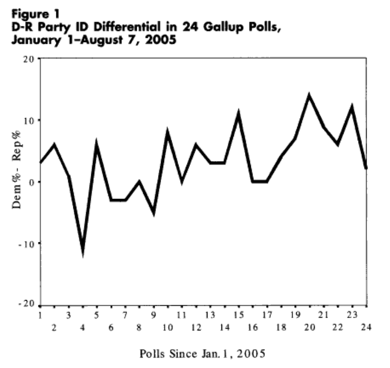
However, polling movement such as this may not always be as it seems. Fluctuations in the partisan composition of a poll’s sample can often create a mirage of public opinion change. This could be due to a few reasons. For one, random variation in partisan composition from one sample to the next could meaningfully shape outcomes like vote choice and presidential approval. Here’s an example of such drastic variation from Abramowitz (2006):
Secondly, beyond just general sampling variability, differential partisan nonresponse bias could be at play. As many have documented (and how I’ve discussed before), partisans’ willingness to partake in political surveys can vary over time. A collection of evidence points to a role for the news and political environment in shaping this willingness and how it varies by party. It’s worth briefly discussing each of these past bits of evidence.
News Environments and Partisan Nonresponse
For example, during the 2016 election, Republicans became less likely to participate in polls when things were going badly for their candidate in Trump (i.e. negative news and controversy, such as the period after the Access Hollywood video release). Gelman et al. (2016) show something very similar for the 2012 election in the time periods surrounding candidate debates (e.g. Democrats becoming less likely to take surveys following a supposedly poor first debate performance by Barack Obama), and describe opinion swings as “artifacts of partisan nonresponse.” Newer (preliminary) research from Mark Blumenthal using SurveyMonkey data appears to show evidence of differential partisan nonresponse in 2018 midterm polling (taken from his abstract):
“SurveyMonkey’s tracking surveys in the Fall of 2018 show a similar pattern. For roughly three weeks following the Kavanaugh/Blasey-Ford hearings in late September, respondents who approved of President Trump – the second question asked on every survey – were more likely to complete surveys than respondents who disapproved. These same surveys showed increases in Republican party identification, Trump approval and a narrowing of the Democratic lead on the generic U.S. House ballot, apparent trends that all regressed to near their prior means in mid-October when the differential response patterns faded.”
In all these cases, differential partisan nonresponse had large implications for horserace results, overstating swings in vote intention and changes in candidate fortunes. Evidence like this is nicely complemented by work in progress from Jin Woo Kim and Eunji Kim. They argue that people pay attention and express interest in politics more when their partisan side is doing well, and less so when their side is doing poorly. For example, using ANES survey data since 1952, Americans who share the partisanship of a well-performing president become more politically interested than out-partisans. As another case study, Kim and Kim use the 2008 Lehman Brothers bankruptcy filing–a source of negative news for Republicans, the party in power–as a natural experiment, and show Republicans paid less attention to politics after this event that created a negative news environment for Republicans (the party in power).
In sum, several pieces of evidence point to differential partisan nonresponse bias as a key shaper of prominent survey outcomes like vote choice. At the simplest level, the partisan composition of a poll’s sample matters a lot for politicized outcomes that are heavily correlated with partisanship. But most pollsters shy away from addressing these issues, as–perhaps most importantly–there’s not straightforward weight for “partisan composition.” Partisanship as a variable is very stable at an individual and aggregate level, but can still vacillate, and no clear benchmark for it exists. Consequently, most pollsters seem to frown upon this weighting option. Weighting to vote choice–for which there’s a known distribution, the margin in the most recent election–represents another option. But given that most pollsters don’t use longitudinal panels, they’d have to rely on recalled vote choice, which is often not viewed positively–people may forget their past vote or recall it in a biased manner (though I’d argue this is a flawed common belief, as the best available data suggests recall is very accurate).
Sample Composition Effects in Trump Approval Polls
Given these issues with possible corrections, most pollsters proceed without adjusting their samples along some partisan dimension. In data I’ve analyzed over the last few years, this decision has implications for polling results, and can readily observed without microdata. The tendency seems to have extended beyond vote intention polls–as much of the aforementioned research focused on–and to approval ratings (for Trump). Specifically, I’ve been using crosstab figures to see how a poll’s partisan composition (the relative distribution of Democrats and Republicans in a sample) relates with Trump’s approval level (e.g. approve% minus disapprove%), and whether this also varies by polling methodology. The distinction on methodological decisions I make is whether a pollster includes a weighting correction for partisanship, past vote choice, or something along those lines. During the first half of 2017, I came up with the following graph:

On the left, partisan composition and Trump approval had no relationship among polls that corrected for their sample’s partisan composition in some way–in other words, taking a step to address partisan nonresponse bias. The right panel, however, shows a fairly strong relationship between the two variables among pollsters that didn’t correct for partisan composition. In essence, their Trump approval numbers came in part to reflect the balance of Democrats and Republicans in their sample, and less so the assessment of Trump, as intended. The fewer Republicans that happened to take a survey (perhaps because of negative news surrounding Trump during his first term), the worse Trump’s numbers looked. Such opinion movement–typically interpreted as minds changing about Trump–would thus turn out to be illusory. (I took an alternative look at Trump approval numbers and also a look at Obama’s approval numbers in other posts with the same overarching topic in mind, and came to similar conclusions.)
Implications for Post-Mueller Report Approval Polls
Circling back the original subject of this post, it’s worth considering what all of this past literature and evidence means for polling after an event like the Mueller Report release. In generating an environment with plenty negative news for Trump, this situation seems primed for a partisan nonresponse dynamic. Namely, mass Republicans might start paying less attention attention to political news in light of negativity swirling around their co-partisan president. Given that taking a poll is itself a political act and a form of expressing oneself politically, this period could easily make Republicans disinclined to participate in polls (whereas Democrats, seeing a more congenial news environment that damages an out-party president, may be more likely to partake in them). In turn, as past examples have taught us, Trump’s approval might decline as a result during this period, but in fact be an artifact of sampling and partisan nonresponse.
The recent result from the Morning Consult poll prompted me to look into the data. The poll showed the worst mark for Trump in all of its weekly tracking history, and the -18 net approval was a sharp drop from a previous -7 net approval. Could changes in the partisan composition of the poll–indicative of partisan nonresponse patterns–be accounting for this drop? To get a sense of this, below I look at the pre- and post-Mueller report release polls and track Trump’s approval and 2018 House vote choice numbers in each. House vote distribution here aims to capture underlying partisanship distribution in the sample (similar trends result using partisanship instead of vote choice):
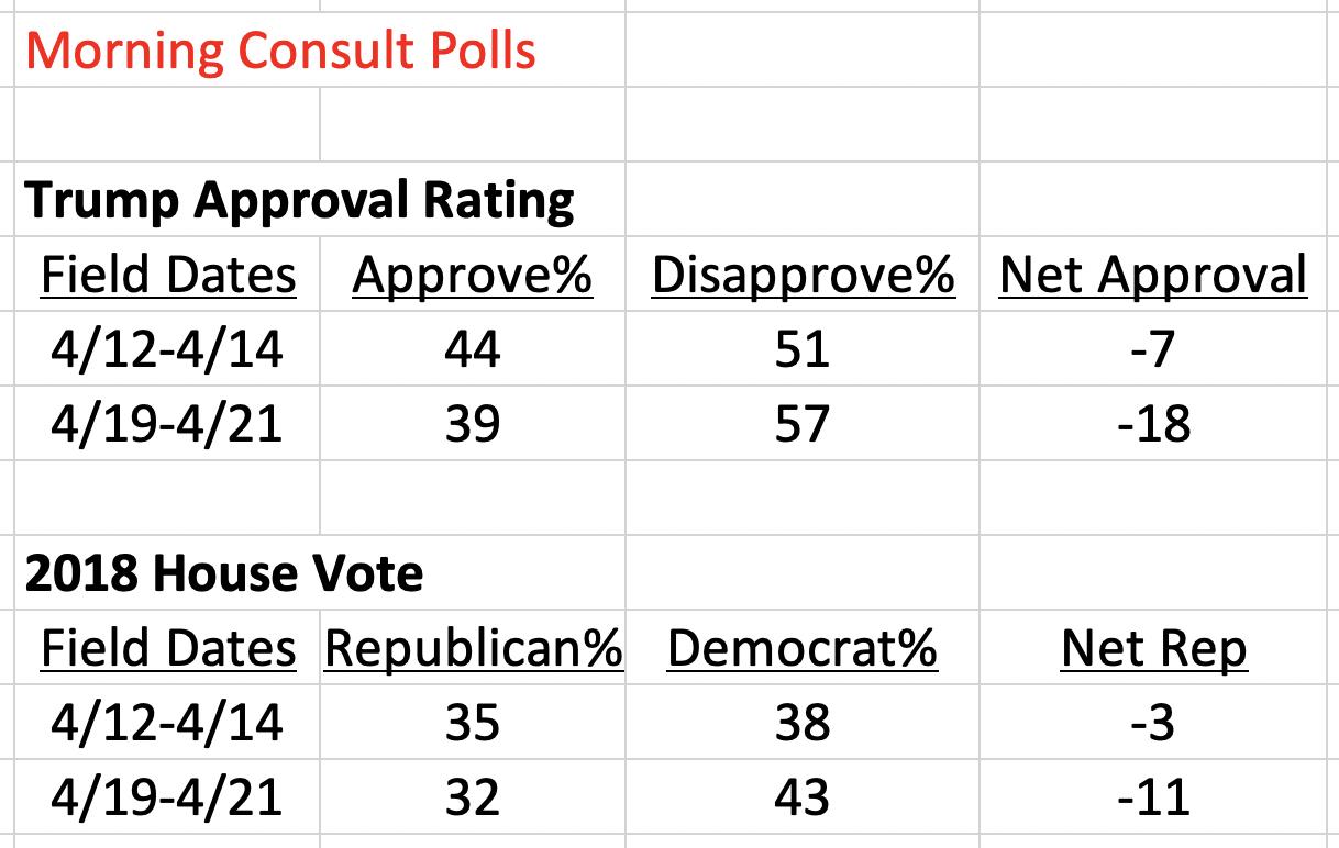
From the period before (4/12-4/14 poll) to after the Mueller Report release (4/19-4/21 poll), the partisan composition of Morning Consult’s polling sample becomes noticeably more Democratic. After being a net -3 points Republican before the report (three percentage points more Democrat than Republican), it becomes a net -11 points afterwards. At same time, as noted before, moving across these polls also reveals Trump’s net approval worsening by 11 points. Although a crude comparison and other factors could be at play, the relationship is pretty clear: as the partisan composition of the poll changes, so too does a politicized outcome like Trump approval. The sample becomes eight net points less Republican, and Trump’s approval declines by a net 11 points. It’s worth noting that unless people are suddenly much more likely to misremember their 2018 House vote (which available data suggests is generally unlikely) then the effect likely flows from partisan composition to Trump approval ratings. Differential partisan nonresponse bias–perhaps spurred by a negative Trump news cycle that dissuaded Republicans from participating in polls–seems to play a role here. Though that’s a specific mechanism that this data can’t precisely isolate, at the very least, fluctuations in Morning Consult samples’ partisanship are strongly influencing their Trump approval results–overstating real opinion change in the process.
Not surprisingly, Morning Consult does not include any explicit correction for the partisan composition of its samples, at least according to its public methodology statement:

Decisions like this, as suggested by my earlier analysis, make polling results most susceptible to partisan nonresponse bias. In other analysis, I ran the same comparison–partisan composition vs. Trump approval–split it up by individual pollsters, as by mid-2018, there was a large enough sample for some pollsters to perform this analysis. The plot immediately below shows this comparison across different pollsters:

Positive relationships emerge in most cases. One of the exceptions is notably YouGov, which weighted to 2016 vote choice in their polling. Morning Consult, on the other hand, shows the strongest relationship–its Trump approval numbers are most strongly affected by the partisan compositions that they happen to get for their samples. To put a numeric estimate on this, below I show OLS coefficients from regressing net Trump approval on net Republican% within each poll:

Results here confirm Morning Consult as the pollster most susceptible to partisan composition effects. A one point net Republican increase corresponds to a 0.86 point net Trump approval increase; the relationship is nearly 1-to-1.
Conclusion
As I’ve reiterated throughout this post, working with crosstab data and attempting to derive meaning without the best possible resources (e.g. like the microdata here) has significant limits. But the presented evidence is still consistent with a growing body of evidence of differential partisan nonresponse bias. Partisans’ willingness to partake in polls varies, often having to do with how congenial the political news environment is to their own politics at a given survey’s field time, and this has big implications for important polling outcomes like vote intent and presidential approval. When confronted with large swings in pre-election polls or approval numbers, observers should always first consider how the partisan balance of those polls’ samples looks and has changed since its previous sample. Otherwise, real opinion change could be confused with sampling artifacts. This also happens to fit nicely with many political science lessons on the stability of central political attitudes in the current age (i.e. partisanship, vote intent, and presidential evaluations); the “bar” for viewing opinion change in these variables as meaningful should be set high. A passage from Gelman et al. (2016) offers a good closing point:
“The temptation to over-interpret bumps in election polls can be difficult to resist, so our findings provide a cautionary tale… Correcting for these [nonresponse] biases gives us a picture of public opinion and voting that corresponds better with our understanding of the intense partisan polarization in modern American politics.”
Addendum 6/1/19:
See here for more data and analysis related to issues described in the above post.

Who’s most likely to take follow-up surveys in panels? Such a question is important to keep in mind when drawing conclusions based on panel surveys (like here and here). When panel survey datasets include the full set of respondents in the first of a survey and the smaller portion of respondents who participated in a later wave/s, this allows one to examine what factors correlate with later wave participation given earlier participation. I’ve used the Voter Study Group dataset to study this question before, finding higher educated and white individuals to be particularly likely to take follow-up surveys. The popular Cooperative Congressional Election Study (CCES), which has pre- and post-election waves, offers potential for a similar and more comprehensive analysis.
The above graph shows the correlates of taking the post-election CCES survey among the entire sample (those who took the pre-election wave) for the last three general elections. A few quick notes on the modeling:
Some observations on the results:
Background
In their article “Does Party Trump Ideology? Disentangling Party and Ideology in America” recently published in the journal American Political Science Review, Michael Barber and Jeremy Pope present a very compelling, important, and timely study. Investigating the extent of party loyalty and the “follow-the-leader” dynamic among the American public, the authors test how partisans react to flexible policy position-taking by President Donald Trump—and one similar case study for Barack Obama—with a survey experiment. The main finding is striking: on average, when Trump takes a conservative position on a policy issue Republicans express more conservative beliefs on that policy themselves, and when Trump takes a liberal stance Republicans too become significantly more liberal as a result. The latter exemplifies blind leader adherence best—even when Trump takes positions outside of his party’s mainstream ideology, mass members of his party still become more likely to adopt his stance.
What about Democrats?
A common reaction to this finding has been questions about partisan (a)symmetries. The study concerned Republican members of the public and their current leader in Trump most. Should we expect the same dynamic among Democrats in blindly following a comparable leader in their party? To address this, Barber and Pope discuss a robustness analysis towards the end of their paper (in the subsection “Robustness: Other Political Leaders as Tests”) that tests for leader effects among Democrats using Barack Obama as the cue-giver. Specifically, they exploit the close similarity between a new immigration asylum policy from Trump—introduced in the spring of 2018—and the policy stance by the Obama administration a presidency earlier (both policies said families/children, when arrested by the border patrol, will be held in a detention facility before an asylum hearing). The leader cues in support of the policy can thus be credibly interchanged (i.e. experimentally manipulated). In an experiment, partisans were randomly told either 1) that this is Trump’s policy, 2) that this was Obama’s policy, or 3) no cue, after which they expressed how strongly they agreed (a value of 5 on a 1-5 scale) or disagreed (1) with the policy.
Barber and Pope describe their results and the implications of them in the following way:
“The results show large effects for Democrats and smaller, but still statistically significant effects for Republicans…
…Democrats are also willing to adjust their preferences when told that the policy was coming from Obama…”
Separating out Ingroup and Outgroup Cues
Though not explicitly stated, the purpose of this robustness study is to test whether evidence of strong in-group partisan loyalty and influence from leaders within the same party appear for Democrats as well. Because partisans are exposed to both Obama and Trump cues, results from this experimental design can speak not only to ingroup dynamics, but outgroup dynamics as well. The analysis approach used in the article, however, cannot distinguish between these two forces possibly at play. This is because outcomes from the experimental control condition (no exposure to a leader cue) are omitted from the analysis. Specifically, to calculate the effects (appearing in Figure 6 in the actual article), the treatment variable makes use of just the Trump cue and Obama cue conditions. The displayed treatment effects are just the difference in policy opinion between these two conditions.
Original analysis
Below is a graph reproducing the results in the original article (with replication data) using the original analysis approach: regressing the policy opinion variable on a binary variable that—for Republicans—takes on a value of 1 if the cue comes from Trump and a value of 0 if it comes from Obama (and the opposite for Democrats). Thick bars represent 90% confidence intervals and thin ones are for 95% confidence intervals. (Note: The original article shows 0.22 instead of 0.23. This is due to differences in rounding up/down.)

Democrats agreed with the policy by 1.18 points less when told it was Trump’s compared to being told it was Obama’s. Republicans agreed with the policy by 0.23 points more when it came from Trump (vs. coming from Obama). It is not clear, though, whether these effects are driven more by partisans following ingroup leaders on policy (Democrats following Obama), or being repelled by outgroup leaders (Democrats moving away from Trump’s stance). Fortunately, this can be separated out. Instead of comparing average opinion levels between Trump and Obama cue conditions, it would be more informative to compare the average in the Trump cue condition to that in the control condition, and the average in the Obama cue condition to that in the control (and again, split by respondent partisanship).
Reanalysis
The below plot presents results from setting the control condition as the reference group in distinct “Trump cue” and “Obama cue” treatment variables, which predict policy opinion among Democrats (left-hand side) and Republicans (right). The Obama cue estimate and confidence interval appear in purple while those for the Trump cue appear in orange.
 After breaking up the cue effects like this, the result for Republicans is no longer significant at conventional levels. The Obama cue treatment does not move their opinion much, while the Trump cue moves them 0.18 points more supportive, but the effect is not significant.
Of course, the key part of this study is opinion movement among Democrats. In making use of the control condition, this reanalysis reveals that the outgroup leader effect from Trump is nearly twice as large as the ingroup leader effect from Obama on mass Democratic opinion, though both dynamics are at play. When told the immigration asylum policy was Obama’s policy during his presidency, Democrats become 0.42 points more supportive relative to the control. This effect is statistically significant, and provides evidence of what this robustness study was seeking: mass Democrats following their own leader on policy. When told the policy is Trump’s, Democrats react more strongly, becoming 0.76 points more opposed to the policy compared to the control (also statistically significant). To sum up, the ingroup follow-the-leader effect certainly arises for Democrats in this study. But the reported treatment effect was driven in larger part by a reaction to an outgroup leader’s expressed stance—a dynamic different than the one at the heart of the original article.
Discussion
Beyond clarifying this part of Barber and Pope’s paper, the specific result should not come as that much of a surprise in the context of related literature. In his 2012 article “Polarizing Cues” in the American Journal of Political Science, Stephen Nicholson uses a survey experiment to find that when party leaders take a position on housing and immigration policies, mass partisans from the out-party move significantly away from this leader’s position. (For example, Republicans oppose an immigration bill substantially more when they hear Obama supports it versus when they don’t hear his position.) Thus, this particularly strong reaction to an outgroup leader cue in Barber and Pope’s robustness study—which likely incited negative partisanship—makes sense.
[As an interesting aside, Nicholson curiously does not find strong evidence for ingroup leader persuasion; partisans don’t follow-the-leader much. This contrasts with Barber and Pope’s main results: as Figure 1 in their paper indicates, Republicans follow their ingroup leader in Trump a considerable amount, but Democrats do not react that negatively to an outgroup leader (Trump) in expressing their policy opinion. Future research should address this uncertainty, paying special attention to 1) cue type (actual leader names? anonymous partisan Congress members? party labels?), 2) study timing (during a campaign? right after one when a president’s policy orientation is not as clear?), and 3) policy areas (will attached source cues be viewed credibly by respondents? do the issues vary by salience level?).]
Do Only Republicans Follow-the-Leader? No
Where does this leave us? To reiterate, the purpose of this robustness study was to check whether the follow-the-leader dynamic was not specific to Republicans (as the main study results may imply) but rather common to all partisans. The experiment does indeed support the idea that Democrats also sometimes follow-the-leader on policy opinion—just not as much as the original results may have indicated.
Moreover, other pieces of evidence support a view of partisan symmetry for this behavior. In the first part of a working paper of mine that builds on Barber and Pope’s article, I evaluate how partisans form their opinion in response to policy positions taken by leaders outside the party mainstream (a liberal position by Trump for Republicans, a conservative one by Obama for Democrats). In both cases, partisans follow their respective leaders. For example, when told Obama has expressed support of a major free trade bill that was previously proposed by Republican legislators, Democrats move 1.11 points more supportive of the bill (on a 1-7 scale) compared to no exposure to an Obama cue.
Second, panel survey evidence by Gabe Lenz in his 2012 book “Follow the Leader? How Voters Respond to Politicians’ Policies and Performance” is also telling. One of the case studies Lenz uses is George W. Bush’s policy proposal to invest Social Security funds in the stock market during the 2000 election (his opponent, Al Gore, opposed it), and how this became the most prominent policy debate during the campaign. From August to late October of 2000—during which the issue became particularly salient—Lenz finds that Gore supporters change their policy opinion most to bring it in line with their leader’s (Gore’s stance of opposition). Given that Gore supporters are more likely to be Democrats, this serves as another example of Democrats following their leader on policy. These pieces of evidence—along with Barber and Pope’s robustness study—thus show the follow-the-leader dynamic cuts across partisan lines.
As part of a recent survey of Dartmouth students, I implemented a survey topic experiment to determine how revealing the topic of the survey when soliciting responses affects the 1) response rate and 2) responses themselves. For background, in order to gather responses for these student surveys, I send out email invitations with a survey link to the entire student body. Partly inspired by past research demonstrating that interest in a survey’s topic increases participation rate for the survey, I created two conditions that varied whether the topic of the survey was made salient in the email message (i.e., in the email header and body) or not. This resulted in what I call a “topic” email sendout and a “generic” email sendout, respectively, to which 4,441 student email addresses were randomly assigned (N = 2,221 for generic, N = 2,220 for topic).
The below table shows the contents for each experimental condition:

Because the survey I was fielding focused on politics and social attitudes on campus, the topic treatment email–on the right-hand side–explicitly revealed that the survey was about politics (both in the header and body). The generic treatment on the left simply described the survey as one from “The Dartmouth” (the name for the student newspaper for which the survey was being fielded) that implied general questions would be asked of students. Much like in other related research, this made for a fairly subtle but realistic manipulation in the introduction of the survey to the student population.
Given this subtle difference, it might come as no surprise that small differences resulted for the outcomes of interest (response rate and opinions on specific survey questions). However, both surprising and expected effects did arise, suggesting that revealing a survey topic–in this case, the political nature of it–does make for a slightly different set of results and could lead to some nonresponse bias. These results are of course specific to the Dartmouth student body, but may have some bearing for surveys of younger populations more broadly.
Students received two rounds of survey invitation emails–first on a Monday night, then another email on the following Thursday night. After one email sendout, as the below Table 1 shows, students in the topic email condition (8.9 percent response rate) were significantly (p=0.04) less likely to respond to the survey (by 1.7 percentage points) compared to the students in the generic email condition (7.2% RR).

Knowing a survey is about politics made students less likely to take it. Speculatively, perhaps this politics survey request–which entails discussing politics and expressing oneself politically–acts as a deterrent in light of how controversy and rancor often become associated with both college campus and national political scenes. In other words, politics could be a “turn-off” for students in deciding whether to take a survey. However, after receiving one more email request to take the survey, students in both conditions start responding more similarly (note: those who originally took the survey could not take it again). Although the topic email treatment still leads to lower response rate, the size of the response rate difference shrinks (from 1.7 to 0.9 points) and the statistical significance of the difference goes away (p=0.34).
The bottom half of Table 1 also shows how distributions for key demographics and political characteristics. Women are five points less likely to take a survey they know is about politics compared to a perceived generic survey–perhaps in line with a view of politics as conflictual and thus spurring aversion as I’ve discussed before–but this doesn’t reach statistical significance. Little difference emerges by race.
Most interestingly, the survey topic treatment causes different pictures of the partisanship distribution. When survey responses are solicited using a generic email invitation, Democrats make up 71.9 percent of the student body; that drops by more than seven points for the politics topic treatment, as Democrats are at 64.3 here (the difference reaches marginal statistical significance). On the other hand, it appears that Republican students select into taking a politics survey at higher rate: the generic email condition results in 14.5 percent Republicans while the topic email condition results in 23.1 Republicans (difference significant at p=0.01). Republicans thus are more inclined to take surveys when they know it’s about politics, while for Democrats they become less inclined to do so. At least in the Republican case–which is the stronger result–one reason for this may be because a political survey affords them an opportunity for political expression in a campus environment where they’re typically outnumbered 3 to 1 by Democrats and therefore might be less open about their politics. Whatever the mechanism is, this result is not totally unexpected: the two highest Republican percentages that I’ve found in surveys of Dartmouth students have come from surveys where email invitations revealed the survey as a political one.
A few notable differences by experimental condition for substantive survey items materialized as well. A battery of questions (shown in the upper fourth of Table 2) probed how knowing that another student had opposing political views affected social a range of social relations. No consistent differences (and none reaching statistical significance) resulted for these questions.
On the question of whether someone ever lost a friend at the school because of political disagreements, however, more students indicated this was the case in the topic email: 17.2 percent did so compared to 10.9 percent in the generic email treatment, a difference significant at p=0.04. Raising the salience of the survey topic (politics) to potential respondents thus leads to higher reports of politics factoring into students’ lives in a substantial way such as this one.

This latter finding is not the only piece of evidence suggesting that the politics email treatment more strongly attracts students for whom politics plays a big role in their lives. Many fewer students report politics rarely/never being brought up in classes for the generic email condition (24.1 percent) than in the topic email condition (13.9), a statistically significant decline. This smaller role of politics in personal lives for the generic email invitation is also evident when asking about how often politics are brought up when talking with friends and in campus clubs/organizations.
Lastly, a question asked whether the political identification of a professor would affect a student’s likelihood of taking the professor’s class. Greater indifference to professor ideology emerged for the generic email and specifically for the two non-mainstream ideologies (libertarianism and socialism); students who took the survey in the topic email condition indicated that non-mainstream professor ideology influenced their course election to a greater extent.
In sum, many of the data points in Table 2 suggest that a survey email invitation raising the salience of the survey topic (i.e., politics) results in a sample for whom politics assumes a greater role in personal life. This intuitive and expected nonresponse bias–although secondary to the more important response rate and partisanship distribution findings–is still worth noting and demonstrating statistical support for.
Inspired in part by a Grimmer et al. (2018) research note that touches on CCES turnout data usage, I calculated turnout bias at the state level in every election that the CCES covers (from 2006 to 2016). I measure bias as the difference between the vote validated state-level turnout from the CCES (survey turnout) and the voter eligible population (VEP) for highest office turnout taken from the United States Election Project (actual turnout). Positive values indicate survey overestimates of turnout, while negative values indicate underestimates. I break up the state-level measures of bias by region to make the visualization clearer, and at national level bias appears at the end.
Results here generally shed light on the reliability of state-level turnout measures generated from the CCES, especially in the context of the research that Grimmer et al. discuss (over time turnout comparisons across state). The data here also reflects the quality of state-level voter files and the ability of the CCES to match its respondents to each state’s voter file. Aside from a few cases, certain states are generally not consistently less biased than others over the last six elections. Bias across states is also pretty volatile and changes a good amount from election year to election year. At first glance, there does not appear to be a pattern to cross-state and across time turnout bias in the CCES.


Vote validation data appended onto survey data is incredibly valuable. Due to the propensity of individuals to lie about whether or not they voted in an election, self-reported turnout is unreliable. Moreover, as that linked Ansolabehere and Hersh 2012 paper shows, this overreport bias is not uniform across Americans of different demographic characteristics, which further precludes any credible use of self-reported turnout in surveys. Checking self-reported turnout against governmental records of whether or not individuals actually voted provides a much more accurate (though not flawless) measure of whether or not someone really voted in an election. I mention that it’s not without flaws because in order to create this metric–validated turnout–respondents to a survey need to be matched to the voter file (each state has one) that contains turnout information on them. This matching process does not always go smoothly. I explored one case of that in my last post (which has since been fixed). Another potential issue was raised on Twitter by political scientist Michael McDonald:
Aside from the topic of this specific discussion, McDonald is making an important broader point that survey-takers who move (have less residential stability) are less likely to be matched to the voter file; even if they turn out to vote, they may not be matched, and thus would show up as non-voters on surveys with vote validation. Younger individuals tend to move more, and so this flaw could impact them most.
I thought it might be interesting to check for evidence of such a pattern with CCES vote validated turnout by age, and compare those estimates against another commonly used data source to study turnout among different demographics: the Current Population Survey (CPS). For the latter data, I pulled two estimates of turnout from McDonald’s website: 1) CPS turnout with a Census weight (which I’ll refer to as “CPS Turnout”) and 2) CPS turnout with a Census weight and a correction for vote overreport bias (which I’ll refer to as “Corrected CPS Turnout”), more detail on which can be found here. I end up with three turnout estimate sources (CCES, CPS, Corrected CPS) across four age groups (18-29, 30-44, 45-59, 60+), all of which I graph below. The key comparison is between CCES turnout and the two CPS turnout estimates. As McDonald describes, the correction to the CPS turnout is important. Therefore, I pay special attention to the Corrected CPS metric, showing the difference between CCES and Corrected CPS turnout estimates in red above the bars for each age group.

These surveys use very different sampling and weighting procedures, so, on average, they likely produce different estimates. If these differences are constant across each age group, then there is likely nothing going on with respect to the movers/youth turnout underestimate theory. However, the difference–the (CCES – Corrected CPS) metric in red–does in fact vary by age. Most vividly, there is no difference in turnout estimate between these two metrics at the oldest age group, for Americans 60 and older. Each metric says about 71 percent of those age 60+ turned out to vote in 2016. However, for each younger age group, CCES vote validated turnout is smaller than the Corrected CPS one. The largest difference (a 12.4 point “underestimate”) curiously appears for the 30-44 age group. This result doesn’t fall seamlessly in line with the youth turnout underestimate theory–which would suggest the younger you go in age group, the larger the underestimate becomes. But the lack of underestimate for the oldest age group–almost surely the most residentially stable of the age groups–compared to underestimates between five and 13 points for the younger age groups is very telling.
I would need to find data on residential mobility/rate of moving by age group in order to confirm this, but it does seem the most likely to move–the youngest three age groups–see a greater difference between a turnout score built from vote validation and a turnout score that doesn’t use vote validation, the CPS. If that’s the case, I think the theory of vote validation missing some movers and thus likely younger Americans (who are actual voters) is convincing. This notion would fall in line with takeaways from past research similarly looking at the ties between movers, age, and political participation. Thus, the results here shouldn’t be too surprising, but this possible underestimate of youth turnout is something researchers should keep in mind when using surveys that include vote validated turnout, like the CCES. Regardless, this represents just one (potential) drawback amid an otherwise extremely useful dataset for studying political behavior. Every survey has its flaws, but few have a measure of vote validated turnout, which will always prove more reliable than self-report turnout metrics found in typical surveys.
In versions of the Cooperative Congressional Election Study before 2016, vote validated turnout was consistently higher than actual turnout across states. Grimmer et al. 2017, for example, show this phenomenon here in Figure 1. Matching CCES respondents to individual state voter files to verify whether they voted using governmental records gives a more accurate picture of voter turnout, but the CCES–as with nearly all other surveys–still suffers from a bias where those who take the survey are more likely to have voted than those who did not take it, all else equal.
However, this trend took a weird turn with the 2016 CCES. Unlike the typical overrepresentation of individuals who voted in the CCES, the 2016 version seems to have an underrepresentation of voters. The below graph shows this at the state level, plotting actual voter eligible population (VEP) turnout on the x-axis against CCES vote validated turnout on the y-axis. The closer that the points (states) fall on the 45-degree line, the closer CCES vote validated turnout approximates actual turnout at the state level.

The line of best fit in red clearly does not follow the 45-degree line, indicating that CCES vote validated turnout estimates are very far off from the truth. For comparison, I did a similar plot but for vote share–state level Democratic two-party vote share in the CCES vs. actual two-party vote share:

This result should suggest that it’s not that state level estimates of political outcomes from the CCES are wholly unreliable. Rather, the problem is more specific to state level turnout in the CCES, which Grimmer et al. 2017 stress. That still doesn’t address the switch from average overrepresentation to underrepresentation of voters from 2012 to 2016 in the CCES. In particular, regarding the first graph above, a set of seven states–at around 60-70 percent actual turnout but at around 25 percent CCES turnout–were very inaccurate. I plot the same relationship but change the points on the graph to state initials to clarify which states make up this group:

CCES turnout estimates in seven Northeastern states–Connecticut, Maine, Massachusetts, New Jersey, New Hampshire, Rhode Island, and Vermont–severely underestimated actual turnout. The below table gives the specific numbers on estimated turnout from the CCES, actual turnout, and deviation of CCES turnout from actual turnout (“error”) across these seven states:

On average, CCES turnout in these states underestimated actual turnout by 38.1 percentage points. It is very unlikely that the CCES just happened to sample many more non-voters in these seven states, which marks one explanation for this peculiar result. Another more likely explanation concerns problems with matching CCES survey respondents to the voter file, as Shiro Kuriwaki suggested to me. This turns out to be the likely source for the egregious error. Catalist, a company that manages a voter file database and which matched respondents from the CCES survey to the voter file, had very low match rates for respondents from Connecticut (40.7 percent match rate), Maine (35.6), Massachusetts (32.2), New Jersey (32.1), New Hampshire (38.2), Rhode Island (37.2), and Vermont (33 percent). The below graph illustrates how this affects turnout estimates:

Catalist match rate (the percentage of survey respondents that were matched to the voter file) is plotted on the x-axis, and the difference in CCES turnout and actual turnout (i.e. error) is plotted on the y-axis. These two variables are very closely linked, and for an obvious reason: the CCES treats respondents that are not matched to the voter file as non-voters. Inaccuracies with turnout estimates in fact reflect inaccuracies with voter file match rate. This weird pattern in 2016 is not about overrepresentation of non-voters in the seven specific states but rather about errors in properly carrying out the matching process in those states. The under-matching issue has received attention from CCES organizers and it appears it will be corrected soon:
What’s still strange is that even after ignoring those error-plagued seven states, you don’t observe the usual overrpresentation in the remaining states without a clear matching problem. Many are close to the 45-degree line (that indicates accurate survey turnout estimates) and fall on either side of the line, with more still under the line–suggesting that in several states, the CCES sampled more non-voters than it should have. The estimates remain close to actual turnout, but I still think this is unusual compared to the known consistent overrepresentation of voters in past CCES surveys (again, see Figure 1 here). Perhaps lower-than-usual voter file match rate–while not to the same degree as in the seven Northeastern states–also contributed to a lower than expected CCES vote validated turnout across many other states. However, it could also be that voter/non-voter CCES nonresponse bias occurred to a smaller degree (and even flipped in direction for some states) in 2016.
Update 2/10/18:
It looks like this issue in the CCES has been fixed and the corrected dataset has been posted to Dataverse.
Update 2/14/18:
I re-did the main part of the analysis above with the updated CCES vote validation data. As the below figure plotting actual turnout against CCES turnout shows, considerable less error results. I calculate “error” as CCES turnout rate minus actual VEP turnout rate. The average error is +0.57 points, ranging from -10.8 (the CCES underestimating turnout) to +10.8 (overestimate), and the half of all states have lie between an error of -3.95 and +5.38.

Do different approaches for constructing partisanship distribution out of the traditional 7-point party ID scale on a survey result in different pictures of over time partisanship stability? That’s a small question I had after reading a recent Pew Research report on weighting approaches for non-probability opt-in samples. The analysis involved considering weights for political variables, the most important being party identification. Pew used a partisanship benchmark built from a certain approach to treating a party ID variable: coding Independent leaners (those who say they are Independents when first asked but admit that they lean toward a party upon a follow-up question) as Independents, and not as members of a party to which they lean. Usually, this decision is problematic, as these leaners overwhelmingly resemble regular partisans in terms of voting proclivities, ideological self-identification, and issue positions, as I discuss in a past blog post. Given this evidence, I was curious in the decision Pew made in constructing a party ID weighting benchmark that treated leaners as Independents.
Additionally, I wondered if their caution about partisanship weighting due to over time change in partisanship distribution (see page 27) might be shaped by their treatment of Independent leaners. For example, their own data shows–specifically as of late–that an approach of grouping leaners with their parties produces a more stable over time portrait of partisanship than an approach of leaving leaners ungrouped and as Independents. To shed light on this question, I turned to three major surveys that provide over time measurement of the public’s partisanship: the American National Election Studies (ANES), the General Social Survey (GSS), and the Cooperative Congressional Election Study (CCES). Though not all of them extend back as far as the ANES does, for example, trends by survey should be informative. Most importantly, in the below graph, I calculate over time partisanship distribution for each survey year cross-section by survey source and approach to handling Independent leaners–grouped (with parties) or ungrouped (left as Independents). I also compute the standard deviation in over time partisanship measurements by survey source and leaner coding approach, which I interpret as an indicator of variability. (One note: because each survey encompasses varying amount of years, comparisons of SD’s should be made between leaner coding approaches within surveys, not across surveys in any way.)

Data from the ANES provides evidence in favor of the suspicion I had–that coding leaners as Independents inflates the over time variability in partisanship that Pew worries about. While the grouped leaner approach results in a 3.45 SD, the ungrouped leaner approach results in a 5.03 SD. In other words, this approach produces an over time portrait of partisanship that has much more variation than the grouped leaner approach. An implication here could be that if researchers want to weight on party ID but are worried about its variable nature, using the grouped leaner approach is safer.
However, evidence from the GSS and CCES surveys offer evidence in the opposite direction. In the GSS case, the SD is larger for the grouped leaner approach (4.49) than for the ungrouped leaner approach (4.26). In other words, GSS time series data suggests coding leaners as Independents results in a more stable picture of over time partisanship. Likewise, the CCES data would imply the same conclusion, as the grouped leaner approach is more variable (SD = 2.80) than the ungrouped leaner approach (SD = 2.54)
In sum, I cannot really draw concrete conclusions about the best approach to constructing a party identification benchmark on the grounds of choosing how to code Independent leaners. It’s worth noting that the difference in variability–as measured by the standard deviation–is largest in the ANES case, which shows the grouped leaner approach offers the most stable partisanship metric. Still, while not to the same degree in the other direction, evidence from the GSS and CCES support the opposite takeaway. At the very least, though, I can conclude that there does not appear to be a difference in over time partisanship stability that results from different coding decisions. Using a party ID benchmark wherein leaners are ungrouped does not exaggerate over time partisanship variability as I thought it might have–at least not in a consistent manner. This of course is a very simple analysis, but it seems like leaner coding is not too much of a problem for partisanship benchmark construction. At the same, it’s worth keeping in mind that in almost all other cases, researchers are better off sticking to the grouped leaner approach.
