While demographics as a force in American politics are often overstated, the historical trajectories of how different subgroups vote merits a close look. Americans of certain races, educational level, age, and gender have differing roles in the coalitions of the two major parties in this country. When underlying demographic compositions start to shift, era-defining political realignments can take place (e.g., Southern whites flocking to the Republican Party in the 1960s). Given that demographics are still important in understanding the electorate, here’s a quick overview of how four key subgroups have voted since 1964, and based on polls in 2016, how they are primed to vote in one day (the 2016 poll numbers are in the yellow highlighted portions of the graphs).
1. Race

White voters have predominantly favored the Republican candidate during this span of elections, except for in 1964 as part of Lyndon Johnson’s landslide victory, and in the two years Bill Clinton won the presidency, 1992 and 1996. Otherwise, whites have always been the best racial group in elections for Republicans. In 2016, there seems to be a small downturn in vote intention for the two major party candidates and a corresponding uptick in support for “Other” candidates. That makes sense given that the strongest third party candidate, Libertarian Party nominee Gary Johnson, does best among white voters.
African-Americans have always overwhelmingly gone for the Democratic candidate on the ballot, and that unsurprisingly will continue in 2016 given recent polls. Hispanic vote intention and its historical context is harder to suss out. For one, I couldn’t include Hispanic vote intention for election years before 2008 in this graph because of a sample size issue, as only in 2008 and 2012 did the ANES include an oversample of this group to overcome this issue. Secondly, this shows a downturn in Hispanic vote share going to Clinton and rise in that going to Trump. That stands at odds with perhaps the best polling data on Hispanics at the moment, which comes from Latino Decisions and most recently has Clinton at 74 percent and Trump at 14 percent among Hispanics–a good amount off from what you see in the graph. It’s probably best to trust Latino Decisions for the closest read on Hispanic voting behavior, and they’ve been insistent that Trump will not overperform Romney’s share of the Hispanic vote–as the above graph would indicate. There are several problems most other polling firms don’t navigate as well but Latino Decisions is likely better equipped to handle, such as survey interview language, callbacks on surveys, and assumptions about the share Hispanics will make up in the electorate. For these reasons and more, getting an accurate read on Hispanic voter preferences has been plagued by ambiguity both in the general and primary election seasons.
2. Age

Drawing meaning from over time trends for vote choice by age group gets complicated because of the changing age cohorts that make up these groups. Given that disclaimer, the above graph seems to hint at a possibly growing split in voter preferences by age. Clinton, for all the worries about her connection to and Democratic primary deficiency with young voters, appears to be building on Democratic Party strength with them–the 18-29 age group–in 2016 relative to earlier years. With Trump at the helm of his party, there’s an even larger difference relative to 2012, but in the negative direction, as his candidacy has pushed younger voters even further away from the GOP. Conversely, in the oldest age group (65+), Trump has seen an uptick in his party’s support from the oldest voters, while Clinton has seen a slight drop among this group.
One random piece of interest here: the graph also shows that the youngest age group at the time fueled the support behind the most successful third party candidate in recent decades, Ross Perot in 1992. It serves as a reminder of the interesting tidbit that younger voters have traditionally been most likely to support third party candidates, even going back to George Wallace’s candidacy in 1968.
3. Gender
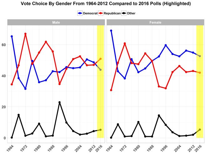
Around 1988, vote choice among male voters became a lot more divided between Democratic and Republican candidates while women began to decidedly vouch for Democrats. According to recent 2016 polling data, women don’t seem any more likely than in recent elections to vote for the Democratic candidate. It should noted that a Fox Poll included in the average (see below section for details) underestimated the female vote for Hillary given what other polls showed. This poll is making the trend more stable than what could otherwise easily be a rise (at the very least) in female support for the Democratic candidate.
The same set of polls examined, however, shows that male voters are breaking a lot more for Trump in 2016 than in recent elections. The Republican candidate could reach a recent high point in 2004 for male support behind the GOP. Given both the trends and current states of vote choice among men and women, gender is likely to prove an equally great if not greater factor in this election than in past ones.
4. Education (whites only)

Due to such a strong degree of Democratic Party support from blacks and to a lesser extent Hispanics, parsing through vote choice numbers broken up by education becomes difficult. (The same issue comes about when using income as well.) It is thus important to distinguish by race when looking at socioeconomic variables. Accordingly, many poll releases include data for vote choice by education only among white voters in their crosstabs. For this reason–i.e., they don’t show vote choice by education for blacks and Hispanics because of small samples for these groups–as well as sample size considerations working with minority groups in ANES data, I only show the vote choice split between college-educated and non-college-educated voters among whites.
Electoral vote choice in the election is becoming more divided on several demographic frontiers, but none more so than on educational level among white voters. At essentially every point in this 2016 election cycle, Trump fared much better among voters without a college degree than those with one. This determinant first was acknowledged during the GOP primary, then held true near the start of the general election campaign, and still remains sharply evident one day from Election Day. Non-college-educated whites are moving in large numbers away from the Democratic Party and Clinton and in large numbers to the Republican Party and Trump. In some sense, this movement explains why Trump has remained competitive in this race. At the same time, Trump is also poised to become the first Republican candidate to ever lose among college-educated whites (at least in the history of the ANES).
In sum, difference in race, gender, age, and now increasingly education have all combined to drive an even greater wedge in the American electorate. Perhaps that contributes to the common feeling that the 2016 election represents some sort of inflection point in this country’s political history. In less than two days, the political landscape will become much clearer, but will assuredly remain rife with division.
Notes on the data: Percentages for 1964-2012 were weighted averages taken from the American National Election Studies. For the 2016 data, there were generally three steps I took to get a sense of how things were shaping up in 2016 based on public opinion polls.
1) I looked at about the 5-10 most recent polls that had publicly available data to inform the four subgroups I examined. The following polls were included in one way or another (i.e., not all were included in every subgroup vote calculation): NBC/WSJ (11/3-11/5), ABC/Post (11/1-11/4), McClatchy/Marist (11/1-11/3), FOX (11/1-11/3), YouGov/Economist (10/30-11/1), and Politico/Morning Consult (10/29-10/30).
2) For the data relevant to ascertaining vote share for the four subgroups, I took percentage vote intention for Hillary Clinton, Donald Trump, and “Other”–Gary Johnson, Jill Stein, and “Other”–and recalculated vote share percentages to exclude the following option percentages from the denominator of the vote share calculation: “Undecided,” “Neither,” and “Not sure.” See here for my reasoning behind this decision. That should explain why vote shares for many of these subgroups will appear higher than if you just look at the given total percentages in polls.
3) Finally, after step 2, I averaged out the resulting vote shares between the two-way and four-way questions (because there are different percentages depending on whether two or four candidates were named when poll respondents were asked about their vote choice). In cases where only four-way percentages were offered, I made an average subtraction from their denominator based on the difference between two-way and four-way questions in other polls for the same question topic.

[…] political belief system only developed in the last one to two decades. For example, see the second graph on my old post here. It shows that shows for the 18-29 age group, vote choice was very split if not […]
LikeLike